Saturday, 29 November 2014

Week 9: Dichotomous Charcaters - Getting There, Slowly but Surely

This week has been a bit of a roller coaster. I presented my work to my tutors at the end of last week and got some mixed feedback. I was told that from my mood boards and current designs that they couldn't see where this was going at all and to be honest I agreed with them. My mood boards were too big and too vague, I needed to narrow them down use those images to inspire some more exciting designs

I proceeded to refine my mood boards and changed my idea slightly.

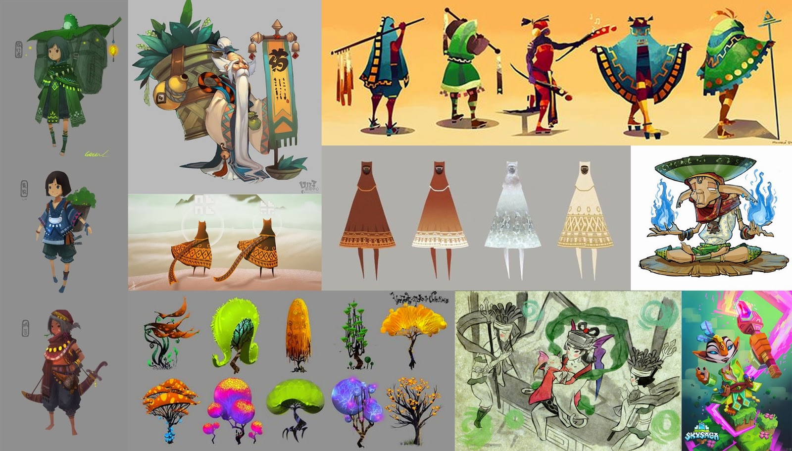
Shaman Mood Board

Faun Mood Board

Style Mood Board

The warrior character I am replacing with a faun, these features stood out to me most on the previous board. The character narrative will now be: A wise shaman lady, with her servant/ forest guardian protecting her as she is frail and elderly.
Silhouettes Development

I took the features that stood out most to me on the mood boards and combined them to develop the silhouettes above, I then chose my favourite silhouettes to take forward and fully develop into ideas.

Developed Concepts

Edited Concepts and Feedback

Final Concepts

My final concepts for my dichotomous characters fill the brief in my eyes. They look like they would belong in the same world together but they are visually contrasting; the shaman is half the height of the faun, the shaman is heavily adorned with clothes and trinkets whereas to the faun has only his flute.

Gradient Tone Test
Choices To Take Forward

I next experimented  with gradients to create different tones, not necessarily looking at the colours, but focusing on the the contrast of values. I then circled my favourites to turn into black and white to see the best value range.

Value Range

Final Value Choices

I chose the two value designs that stood out most and worked best when next to each other. I drew up my final orthographics ready for modelling.

Shaman Orthographic

Faun Orthographic

Colour Concepts

I even started on some initial colour concepts. I feel like I have achieved a lot this week, and I can't wait to start modelling! At the moment I feel confident that I will have enough time to model both characters, and maybe even rig one of them. Its going great.


Friday, 21 November 2014

Week 8: Dichotomous Characters

New project this week, I was pretty pumped after my last one, ready to go all out for this one. However after the lecture I found I was a bit deflated. Characters? They're least favourite thing. But I decided to pick myself up and look at the brief properly.

We have to design a pair of characters, which work well together and are visually shown to exist in the same world, bit be as dichotomous as possible, contrasting in as many ways a possible. They have to have an emphasis on their storytelling and narrative potential. We only have to model and texture one, the other is a stretch goal.

I was well and truly stuck so I just, thought. What won't I get bored with? Vikings. So I began to research vikings on interest for some visual inspiration, and my pinterest board developed from viking warriors to forest people to shamans and old people.

I came up a old shaman lady and a big brass warrior seeking her aid on a quest, so I made 2 mood boards to narrow down my inspirations. Also made a style board as I came to the conclusion quite quickly I wanted to do stylized rather than realistic characters

Shaman
Warrior
Style

After this and speaking to my one of my tutors I made a quick shape kit and began to put the other basic shapes to create very basic character silhouettes.

Shape Kit

Silhouettes

I then drew over the top of the silhouettes to get an idea of how I could use these shapes as body parts and features of potential characters. This was really really rough.


First Concepts

I then asked my peers for some feedback as to which had the strongest silhouettes and features so I could choose a few to take forward and develop.


As shown by the feedback, the 3rd from the left top and the 2nd from the right on the bottom got the most positive feedback. Also I subconsciously made the pringles guy. These are the two main I will be taking forward to develop, not only because of the feedback, but they were also my gut feeling potential awesomeness designs.


Sunday, 16 November 2014

Week 7: Sentry Gun Post Mortem

This week was the last week of my sentry gun project, and I finished it to a standard I am over the moon with. I actually had time to not only fix everything and make it work correctly in in engine, but also time to experiment with different effects.

Final Sentry Gun Render

My texture turned out pretty good too, I like how I managed to create a rough rocky grainy texture for the stone parts and a nice crisp crystal blue for the power crystals and crystalline sections of the crab.

Sentry Gun Albedo Texture

I struggled with the engine work quite a bit though, when I first set up my turret the main body shell would move around the axis correctly however the claws would not rotate at the same axis, so they clipped my model.

Eventually I fixed everything so it worked correctly, then I had a chance to play! I made an emissive map so my crab and its projectile would pulsate light.
 
Emissive Glow on High
Emissive Glow on Low

I also had a chance to slow down the rate at which the projectiles and ejected casings were fired, and their lifespan (how many would be on screen at once). I did include a sound when ever a projectile is launched, however I can't show you through photos!

Play Test

A nice touch was that when you got near the sentry gun, it would tilt up like a little crab saying hello, and I fell in love, he's so cute! This gave me an idea for the last minute add we had for the project, a marketing poster. I had no clue before this moment, but some quick inspiration had me throw this together quickly.


Overall I love how this has turned out, there were parts I struggled with but I still thoroughly enjoyed the experience. I have learned so much, what I'm good at and what I really need to work, and how. Again my most valuable tool has been talking to other people, for feed back and help. They've helped me and I even helped out others struggling with parts that I managed to fix. Finally I'll just throw in the rest of my beauty shots, taking a look at different angles of my crab.


Saturday, 8 November 2014

Week 6: Sentry Gun - I LOVE THIS PROJECT

Picking up from last week, I chose the crab that I felt I could push the most from my previous concepts and began to develop it further. I'm having the time of my life with this project now.


I ended up going with concept 8, I felt this had the most balanced silhouette and in general just looked awesome, so I wouldn't get bored making it! So I cracked on this week with the modelling and I think my model turned out pretty well. I only had to model half of the crab as the entire model is symmetrical, meaning I could just copy the assets and geometry across, flip it and weld it together.

Front Mesh View
Side Mesh View
Elements Mesh Top View

Final 3D Model

Unwrapping was surprisingly easy, I'm not sure if its because I'm one of those weirdo's that like unwrapping and I'm getting better at it, or if I just made a really easy model to unwrap. Either way it went great.

Turret Unwrap

It was at this stage I thought I should probably do the job I had been putting off, colour concepting. So I did a quick clown paint of my model and then just overlaid colours quickly in Photoshop for fast results.

Colour Concepts

Final Concept

It seems 8 was my lucky number again in colour concepting, it was my favorite as well as my peers, I used the colours from crystals to inspire the colour schemes.

Just one week to go, I still have to texture but then I have a chance to play around in engine!

Sunday, 2 November 2014

Week 5: Sentry Gun Fun

This week I was given a new project brief. 

In 3 weeks we have to produce a working sentry gun , from concept all the way to attaching it to pre-made 'blue print' in Unreal Engine so it moves and shoots at you. The only real design constraints of the project are it has to be made of 4 parts; base, horizontal yaw, gun pitch and barrel, and it has to be 5,000 tris or less.

I had crazy ideas like an Egyptian god turret, or Roman gladiatorial combat guns etc, completely off the wall stuff...  but I found that when sitting down to begin I was at a complete loss. Too much creative input had been thrown at me with my head going 'what do I do, how do I even art anymore'.


Trying to steer myself in a sensible direction I started looking at designs of current sentry turrets and apart from finding a really cool Ghost busters turret deign, I was still hitting a wall.


How was this inspiring me? Not at all really. I talked with my tutors and we came to the conclusion that, because I wasn't interested in making standard 'normal' turret designs why the hell was I looking at them for inspiration.

Back to the crazy ideas! To help with the idea flow we were asked to bring in an objects that we could take inspiration from, so being indecisive I bought in a lantern, a carriage clock and a toy Lamborghini. I made mood boards:

I decided to throw in a few buildings to get some crisp and clean interesting silhouettes along with the Lamborghini lights and sharp edges.

With the lantern and clock mood board I went for more crazy silhouettes and styles to give me some really whacky ideas.

I still felt like there wasn't enough inspiration in front of me so I wrote down a load of things I liked on several bits of paper, and picked 3 at random. I got crabs, crystals, and Norse mythology. Well this should be interesting.


With the Norse mythology mood board I focused mainly on symbolism and the Norse pattern for ideas on how to decorate my turret.


Crabs board, has lots of cute crabs I could turn into a theme for my turret.


This is my favourite mood board, I really want to use this for the material of my turret, and the colour scheme.

After making all my mood boards I decided to throw them all together and create a bash kit, so I could build all of the really cool crab-crystal-lantern-clock-car whatever they are turrets.


And these are my first iterations with the bash kit I created. My tiny crab minions!


I think that these are looking pretty cool and I'm already getting ideas of how to mash them up further. Stay tuned for next week, where the crabs get crazier and more awesome (I hope!)