As part of our Critical Studies looking at art direction at the moment, we were asked to look at a painting, photo, film or game and analyse it.
I am looking at the art and ideas behind the two new Star Trek films, directed by JJ Abrams. The same artistic principles apply when designing and making films as with games, from the film itself to the advertising posters.
The composition of this 'Star Trek Into Darkness' poster draws your eyes immediately to the figure of Khan the main antagonist and the star fleet logo surrounding him.
The silhouette crumbling around him, suggesting that star fleet falls to his feet, where there are a pile of smouldering ashes.
The city of San Francisco in the background is next perhaps?
The shape and form of the star ships are incredible in the way you can tell the ones that belong to the protagonists apart from the ones antagonists use. The Vulcan jelly fish ship reflects the Vulcan's love of all lifeforms, the ship almost looks alive with the blue energy membrane and the smooth clean lines give a feeling of good.
The Enterprise also has this aura of good, with sleek bold lines to shape it. The shape is so iconic as its very similar to the original Enterprise.
Whereas the Romulan ship the Narada is jagged with harsh and angular lines, like a dark sea creature with tendrils giving the vibe of an evil entity.
The landscape of Nibiru (the alien M class planet at the beginning of 'Star Trek Into Darkness') looks like it could belong to parts of our own world, much like a primitive Asia.
However the colour red is used to illustrate that it is an alien planet; we are so used to to associating foliage with greens and browns that the difference is striking.
Colour can also be used to illustrate a change of mood or environment. This is a normally function engine room concept, with a safe a clinical feel...
...but as son as you add the red light, an element of danger is present. This is due to our minds association with danger and the colour red.
The mood in this scene is shown by the dark red dangerous radiation zone that kirk is situated in and the contrast of the the safe bright area of the ship that Spock is in.
Spock is incapable of easing Captain Kirks passing, his distress at loosing someone he can finally call a friend, overcomes his Vulcan composure and his human side lets his emotions run wild. The colours of green and blue add an upsetting sickly hue to the scene.
The hands trying to touch through the glass is a strong symbol of friendship, in the shape of the Vulcan salute, the Ta'al.
The sickly tones of kirks face show his end is near yet he is still trying to comfort Spock.
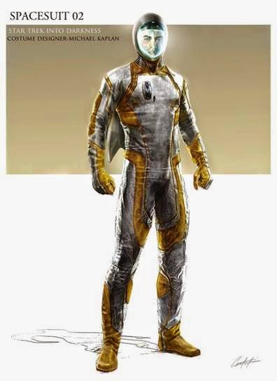
I really like these concepts from into darkness, the volcano heat protection suit with its strong colours and the patterns, the space jump suits with its textures and sleek design, which are both practical in their design as well as and unique.
The Klingons and Nibiru native aliens are striking in their appearance, with the facial piercings and scarification which is reflective of their tribal cultures. The Klingons being a warrior and war based race, with honour and reputation extremely important, comes across heavily in their designs.
The native aliens
are a like a very simplistic tribal group, with tattered clothing, face
paint and piercings made from bone or plants. Their biological design is humanoid but the features a quite puffy, like an embryo, which could represent their early humanoid civilisation.
I would choose this scene of Spock chasing and fighting Khan to turn into part of a game. The chasing would be much like how you chase targets in Assassins Creed, jumping over objects thrown in the way.
There could be a quick time events, each time Khan tries to crush Spock's skull.
The garbage truck that they are fighting on has already been designed and
3D modelled for the special effects of the film, therefore to transition
the model for a game would not take too long.
Star Trek is currently 48 years old , but everyone knows what it is or at least something about it. It is so iconic that you can recognise it form the red yellow and blue shirts.
The new films have captured the spirit of the original series and given it a new direction, making it more appealing to modern audiences. The original Star Trek was suited more to long attention spans whereas today people are used to fast paced action rather than the speed of submarine warfare.
The casting has been flawless in both looks and personality, especially for Spock and Captain Kirk, Leonard Nimoy only agreed to be in the new films if he had control over who would take up his role of the new Spock.
A lot of work has gone into the new Star Trek , there are now even comics, games and costumes form the ideas of these films. It really shows how a good design can be timeless. That is what I will one day strive to achieve, a timeless design, making my work a memorable imprint on the world no one will forget.


